UltiMed Corporate Rebrand | Brand Identity & Guidelines SystemUltiMed had outgrown its brand. An early-2000s logo with clashing typography, inconsistent product identities across four brands, and no documented brand standards left the company looking smaller than it was.
As the business approached $37M and two private equity transactions were on the horizon, the brand needed to reflect the company's true market position—a sophisticated, precision-focused medical device manufacturer and world leader in safe needle disposal.
2012 Rebrand | 4 Product Brands | 22-Page Brand Guidelines | Full Identity System
The Challenge
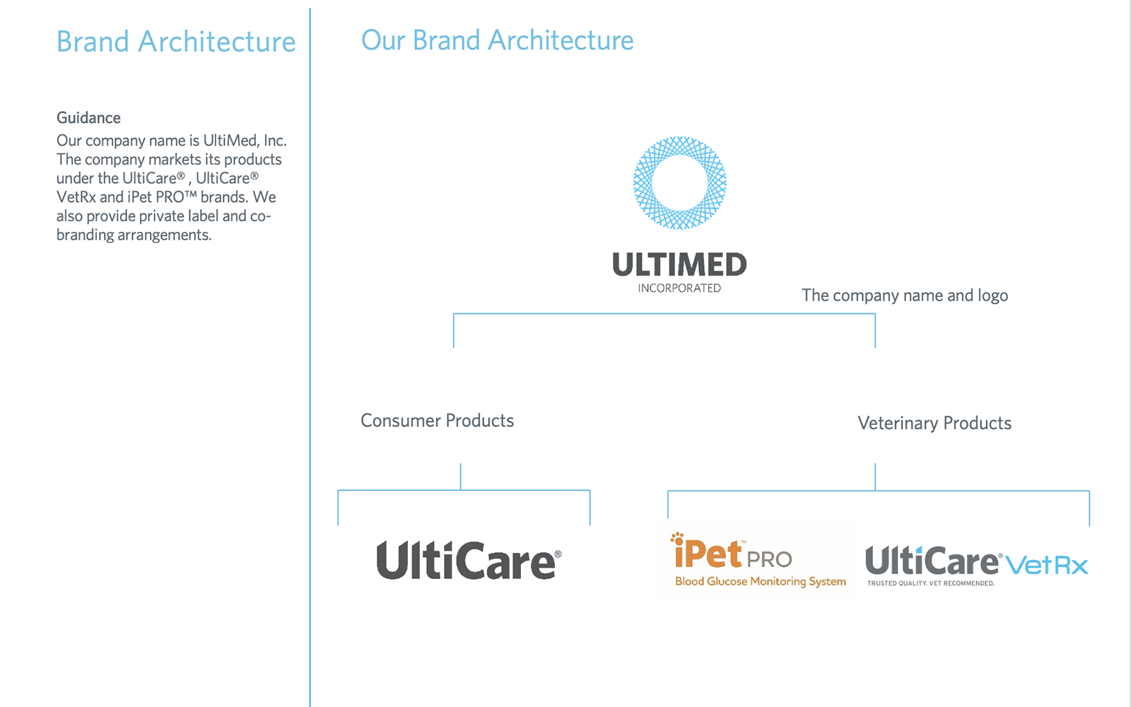
UltiMed operated four distinct product brands—UltiCare (consumer), UltiCare VetRx (veterinary), iPet PRO (veterinary), and UltiGuard SafePack (consumer & veterinary/proprietary system)—with no unified brand architecture governing their relationships to one another or to the parent company.
The original UltiMed logo featured mixed typography, clashing colors, and a design aesthetic that hadn't evolved in over a decade. As the company pursued private equity transactions and expanded into new channels and markets, inconsistent brand presentation was creating credibility gaps with distributors, retail partners, and institutional buyers.
The strategic need: a modern corporate identity that could anchor a house of brands, support PE due diligence, and signal UltiMed's evolution into a sophisticated healthcare manufacturer.
The Approach
A complete corporate brand transformation—from logo redesign and identity system to a comprehensive brand guidelines document governing four product brands across consumer, veterinary, and institutional markets.
Logo Redesign & Brand Identity
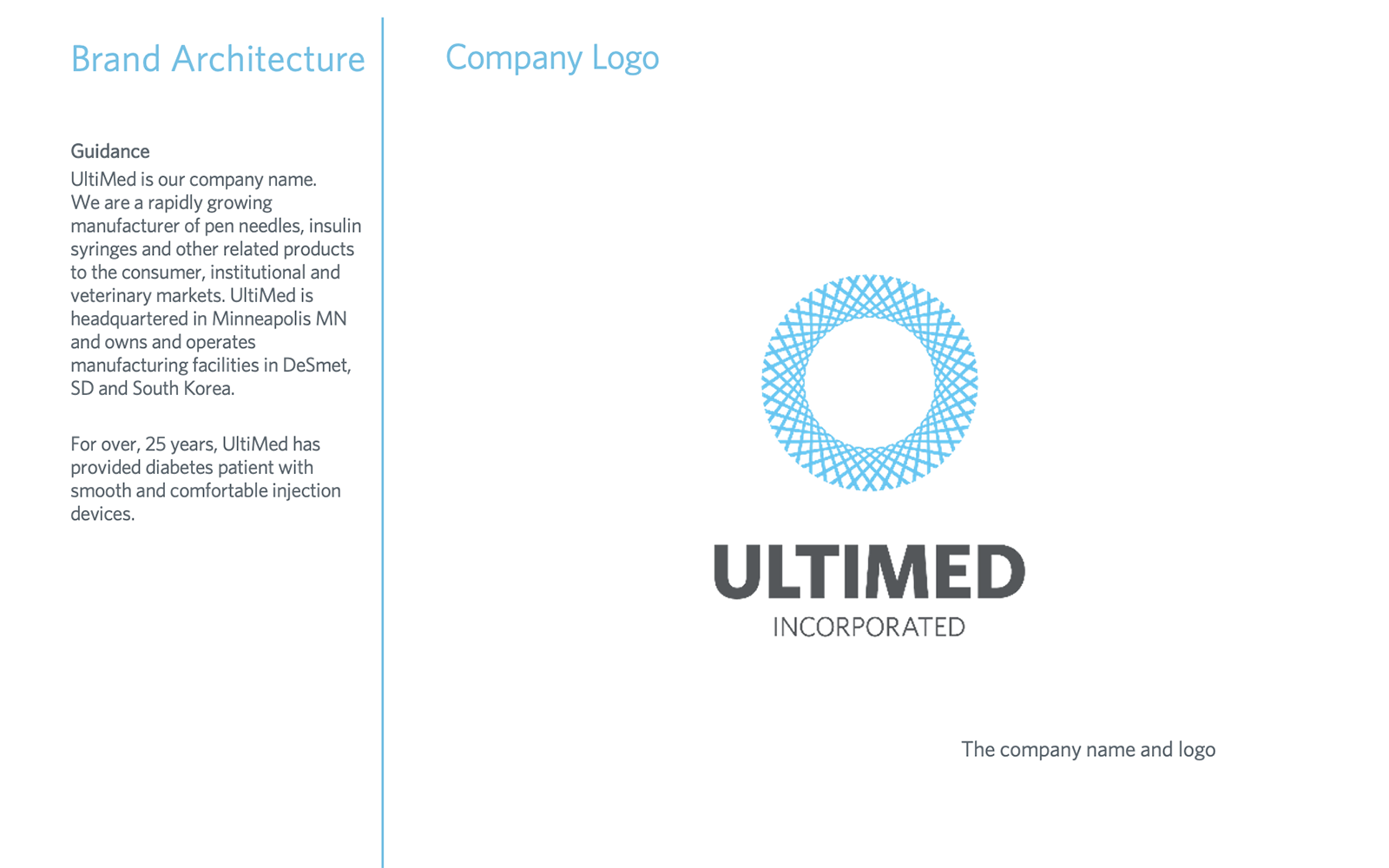
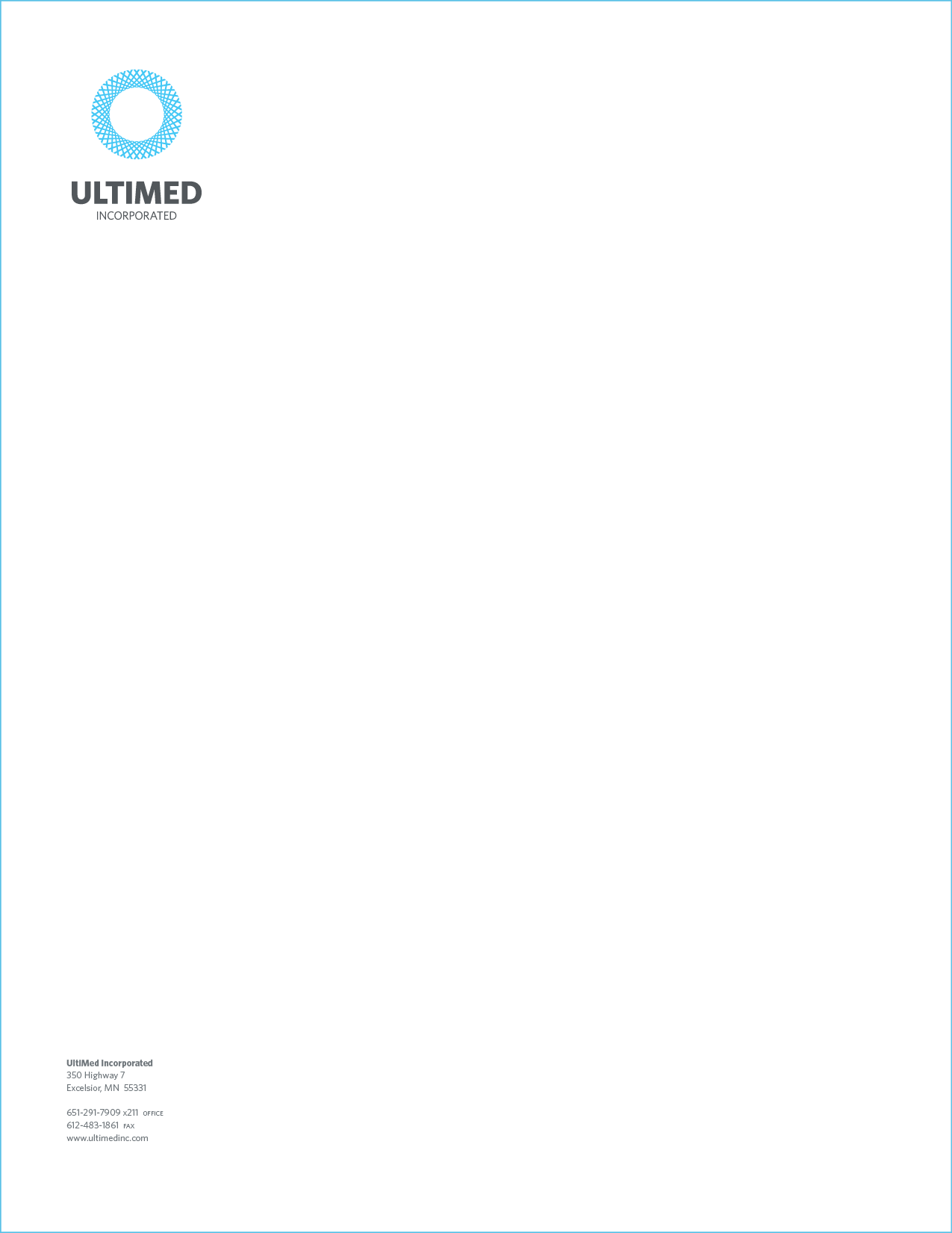
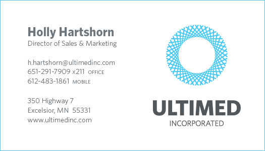
Replaced the outdated logo with a sophisticated interlocking circle mark—a deliberate design choice reflecting precision, connectivity, and the cyclical nature of UltiMed's core product innovation (dispense and dispose). Clean, modern, all-caps ULTIMED typography in grey, paired with the light blue mark, positioned the company alongside premium healthcare brands.
Worked with Seth Johnson Design to execute the identity, directing the creative strategy and ensuring the new corporate mark visually invoked the UltiCare product brand without replicating it—creating visual coherence across the brand architecture while maintaining distinct parent and product identities.
Brand Architecture & Guidelines System
Defined UltiMed's brand architecture with the corporate identity as the anchor and four distinct product brands operating beneath it—each with its own visual identity, color palette, typography system, and logo usage rules.
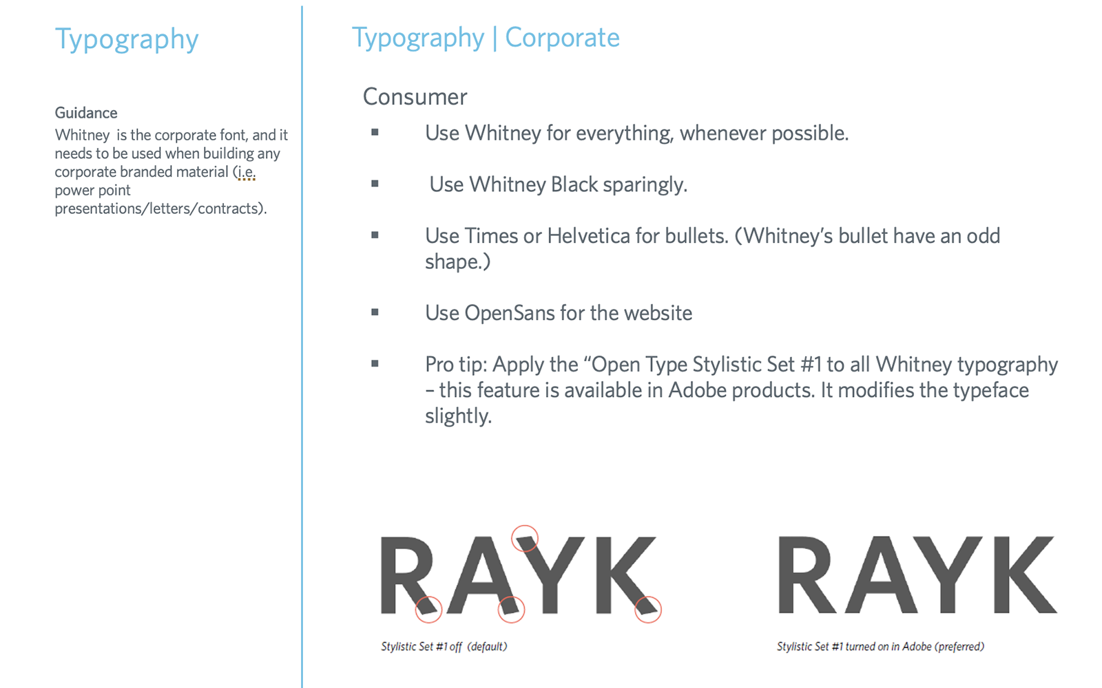
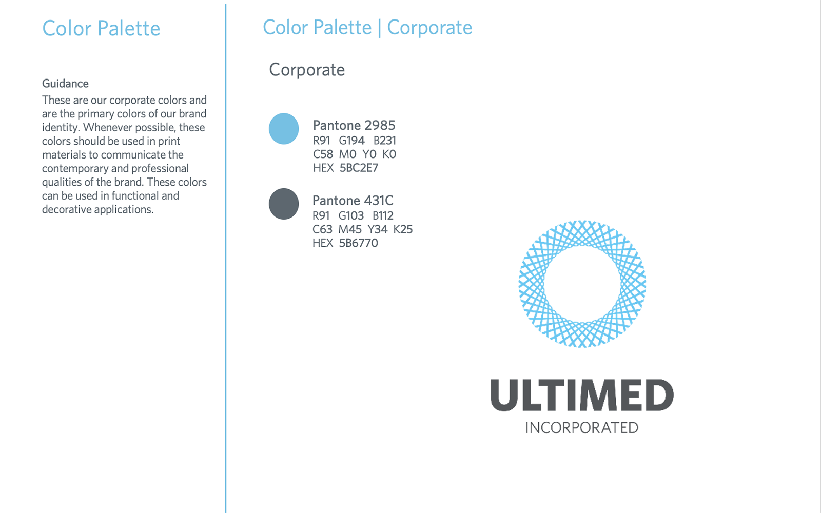
Documented the complete system in a 22-page corporate brand guidelines document covering brand positioning, mission statement, tagline and value proposition, four brand pillars, brand personality framework, corporate and product color palettes, typography system, and logo usage rules—giving internal teams and external vendors a single source of truth for consistent brand execution across all touchpoints.
Identity System Rollout
Applied the new brand identity across all customer-facing touchpoints—business cards, letterhead, envelopes, website, trade materials, sales collateral, distributor communications, and internal documents—ensuring consistent brand expression from the pharmacy counter to the PE boardroom.
The Result
Complete brand identity system—delivered on time to support two private equity transactions.
The UltiMed rebrand elevated the company's market presence and credibility across every channel—from retail pharmacy partners to institutional distributors to private equity buyers.
A documented brand guidelines system provided internal teams and external vendors with a single source of truth for brand execution, eliminating inconsistencies across four product lines and multiple markets.
The new corporate identity anchored a unified brand architecture that scaled with the business—from a $4.5M startup to a $37M market leader—and supported the commercial story that led to two successful PE transactions.